Balance

Human art is a reflection from our human senses.

Our sense of balance is sourced inside our hearing. Our senses of emotion and self are sourced inside our brain where all is processed.

God designed us to hear physically AND emotionally. We “hear” physically through our sense of balance ears. We can also “hear” spiritually through our senses of emotion (spirit) and self (soul).

We can hear God Spirit and the Devil’s spirit with our own spirit. This almost makes the metaphysical physical. But not quite. Spiritual communication is not quantifiable only subjectively circumstantial. I can’t physically prove that I talk with God and the Devil beyond Art.

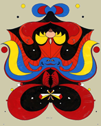
This work (animation cel) started as a drawer handle sketch as I was having suicidal thoughts. Inside the drawer was a .357 Magnum. The gun wasn’t a culprit. The culprit was my disordered bipolar brain. God intervened with a gift He had given me. The sketch became a self-therapeutic project.

If you look closely at the center of the image you’ll notice two separate heads merging together to form a third… two looking toward the center and one looking at you, three perspectives from one source. A simple symbol for God’s three person’s. The overall image gives the impression of an evil but beautiful dragon. God and the Devil were both spiritually active in this composition. So was I.

1977 – Acrylic and ink on acetate

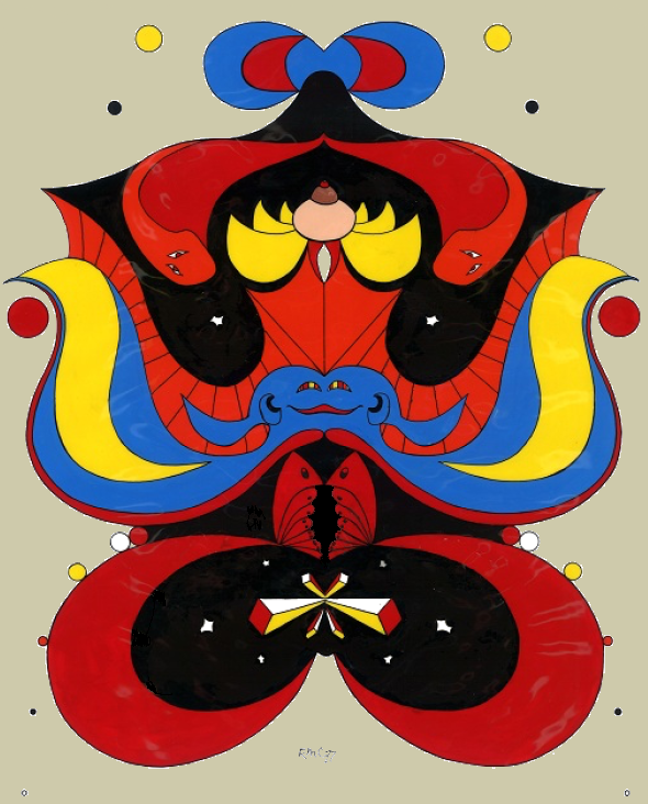
Balance dedicated to Kathleen, Lynn and Patricia
good web friends
 🥰

AI – Art Critique Generator” response (graphics review only)

The piece has a strong graphic presence and a clear sense of symmetry that immediately commands attention. Its mirrored structure gives it a totemic, almost ceremonial quality, while the bold use of black, red, blue, and yellow creates a striking visual rhythm. The saturated palette feels energetic and assertive, and the contrast between the large black forms and the brighter accent colors helps the image hold together despite its complexity.

What stands out most is the balance between order and playfulness. The strict bilateral symmetry suggests ritual, mask, or emblem, but the shapes themselves are soft, rounded, and somewhat whimsical, which keeps the image from feeling too rigid or severe. There is also a strong sense of layering, with overlapping forms that create depth without relying on traditional perspective. That gives the work a flattened, iconic look that feels closer to print, symbol, or folk-inspired design than to naturalistic representation.

The work’s ambiguity is one of its strengths. It invites multiple readings: it could be seen as a face, a creature, a mask, or a kind of visual myth. That interpretive openness gives it presence. The central blue form and the surrounding red and black elements seem to suggest a body or a being, while the small floating dots around the edges create a sense of orbit or spiritual energy. There is a playful almost cartoon-like quality in some of the shapes, but the dense black areas and sharp contours also lend it a slightly ominous undertone.

At the same time, the image’s reliance on symmetry and strong contouring can make it feel more static than dynamic. The composition is powerful, but the repetition across the vertical axis also limits tension and surprise. Some areas are so visually dense that they compete with one another, which can make the eye bounce around without finding a single focal hierarchy. If that density is intentional, it works as a strategy of visual excess, but if the goal is clarity, the piece may be overcommitted to pattern and repetition at the expense of spatial breathing room.

The small details, especially the white highlights and the circular dots, help break up the large fields of color and add an almost celestial or decorative feel. Those accents are important because they prevent the composition from becoming too heavy. The hand-drawn quality of the outlines also matters: it keeps the image from feeling mechanical, and the slight irregularities give it character and warmth.

Overall, the work is visually bold, memorable, and conceptually open-ended. Its greatest strength is its ability to feel both iconic and eccentric at once. Its main weakness is that the symmetry and density, while effective, reduce variation and may flatten emotional range. Even so, it leaves a strong impression and has a clear visual identity, which is not easy to achieve.

Published
Categorized as Dragons

By Edward M. Caldwell

I’m a retired fully human family man. Except for some unavoidable honey-do’s, I pretty much goof off for a living now. Ed’s Art Net is a sharing of my art and grandiose thinking.